"Motif knitting" is something that even beginners can easily try.
One of the most well-known and classic "motif connecting" techniques is the square-shaped granny square.
Motif knitting, which can be made from small pieces, is a great way to learn the basics of crochet while having fun.
This time, we will introduce "Granny Square color matching variations" in the form of a color chart, which will affect the impression of your work.
When I was a beginner at crocheting, the first thing I made was a granny square.
At that time, I just wanted to try knitting right away, so I remember knitting motifs using the colorful embroidery thread I had on hand.
After that, when I tried knitting various pieces other than the motif, I was reminded of the appeal of granny squares.
The first thing that comes to mind is,
Granny squares are one of the easiest circular knitting techniques!
Not only is it easy to knit because it's a double stitch, but it's also easy to see (and count) the stitches!
The knitted fabric is very even, so it's easy to achieve a neat finish!
For these reasons, we recommend the Granny Square to beginners to crocheting.
Now let's take a look at granny squares from the perspective of color matching!
Index
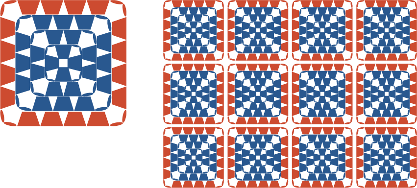
Granny Square Knitting Pattern
First, here's the knitting pattern for the granny square.
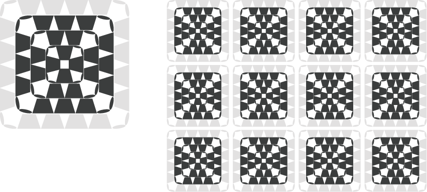
The knitting pattern on the left in the image below is the simplest granny square.
The knitting pattern on the right has a little ingenuity that results in a neat finish with the start point not being noticeable.
At the end of the row, crochet a double crochet in place of the two chain stitches at the corner. At this time, insert the needle into the third stitch of the starting chain and crochet a double crochet.
From there, continue by knitting three chain stitches at the start of the next row, then pick up the entire double crochet stitch (pick it up in a bundle) and knit two double crochets.

Granny squares are great for connecting motifs, but even a single motif can be used to make coasters, and if you knit one large, you can even make something like a basket cover.
Your preferred color combinations may be different when connecting motifs and when using a single motif.
It's cute to knit lots of colorful motifs, changing the color every row, to create a retro-pop piece, or you can reduce the number of colors to create a piece with a more stylish feel.
The color chart that we will introduce later is an example of color matching variations.
I hope this helps you find the right color match for your granny square.
Two-tone granny square
First, let's start with a simple color combination using two colors.
This is an example of changing the color of only the final row of the motif.
The great thing about motifs with a limited number of colors is that they are easy to coordinate with clothes when made into bags and other items.
The first is a pattern that uses a light color in the center of the motif and a more toned color in the final row.
On the right is an image of what it would look like with multiple motifs lined up.
The final layer is edged with a toning color, giving it a clean impression.
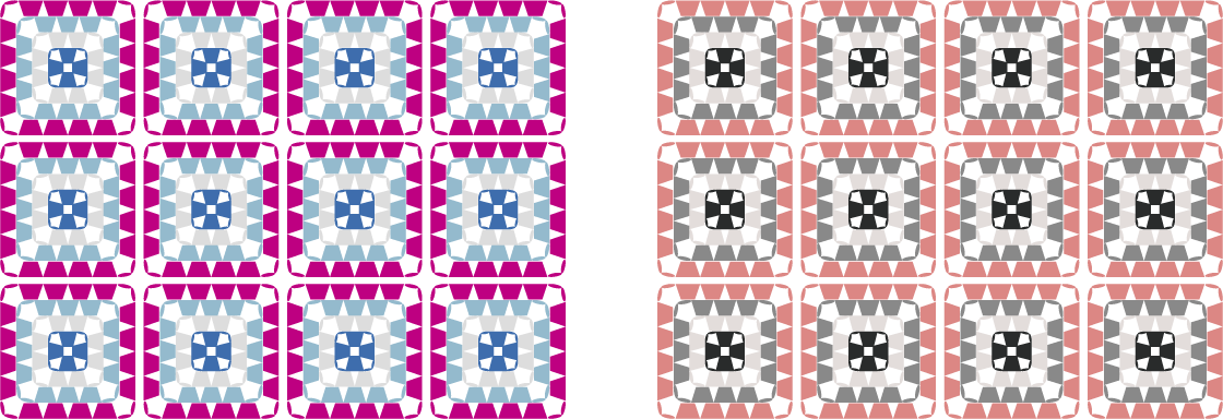
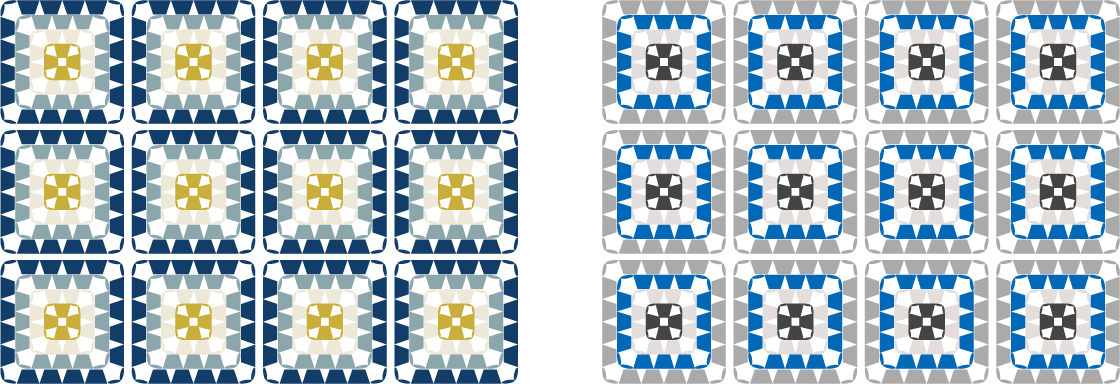
Ivory x Dark Green
<Color image>
- An elegant, calm and mature tone.
- By combining it with a modern dark green, it will look like it blends in with contemporary interiors.
- The combination of green, reminiscent of plants, and ivory, which resembles undyed wool, goes well with natural and organic designs.
- The color scheme is not too sweet, making it easy to match with living room accessories used by the family.
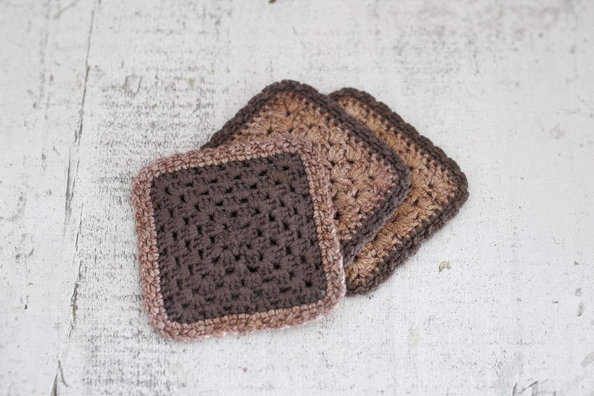
Dusky pink x cocoa brown
<Color image>
- A cute and mature tone. The use of a smoky pink with a subdued sweetness creates a calm atmosphere within the cuteness.
- The soft brown tightens the overall look, making it a combination that easily blends in with antique goods and shabby chic interiors.
- The calm and slow color scheme makes it suitable for use as a blanket or cushion for relaxing.
- The soft color tone is not too bold, and it blends well with the skin, making it suitable for fashion accessories such as bags and shawls, giving it an elegant impression.
Green has a refreshing, dignified feel, while pink has a calming, warm feeling. The same granny square can look different depending on the color combination.
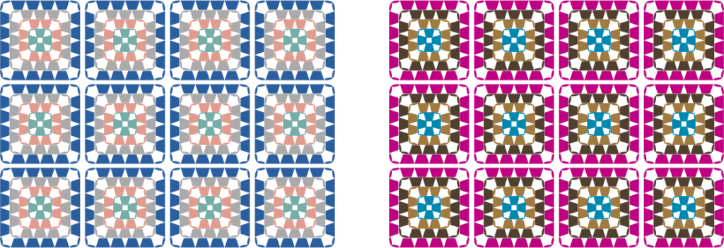
The second is a combination of a dark color in the center of the motif and a light color in the final row.
It has an impact that catches your eye immediately and makes it easy to express your individuality.
Magenta pink x baby blue
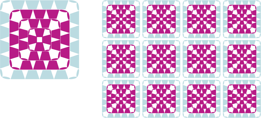
<Color image>
- The pop, lively and bright tones and the use of bright magenta pink create a playful atmosphere that lifts the spirits of those who look at it.
- The French pop colours make a great accent colour for a simple interior.
- By placing a dark color in the center, the geometric pattern stands out, creating a striking color that catches the eye.
- The energetic color scheme can be incorporated into small items such as pouches and small drawstring bags inside your bag to add excitement to your everyday life every time you pick them up.
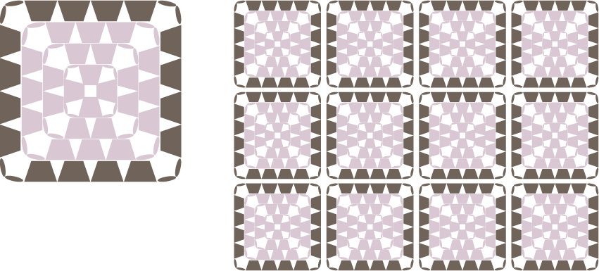
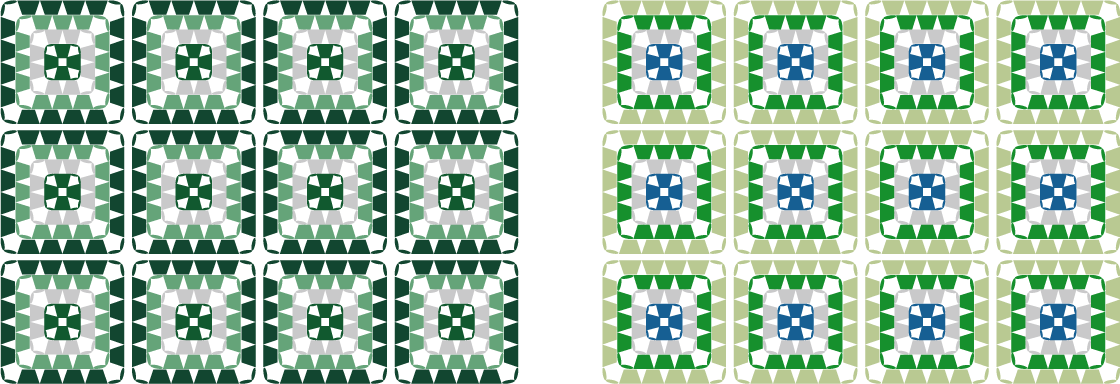
Charcoal gray x light gray
<Color image>
- Urban tones. The color scheme, composed entirely of neutral colors, adds a modern and stylish impression to Granny Square's traditional pieces.
- Monochrome brings about tranquility and calm. It is a color tone that does not clash with any interior color and gives a quiet dignity to the space.
- A sophisticated combination that highlights the texture of the materials. By deliberately eliminating color, the texture of the yarn itself and the look of handwork come to the forefront.
- The timeless color scheme is suitable for all genders and ages, and matches a wide range of items, from main items in your room to accessories used in business situations.
If you want to create a lively and esprit, try a pop color scheme, or if you want to create an urban serenity, go for a monotone. Even if you combine items with impact, the impression can change drastically depending on the color tone.
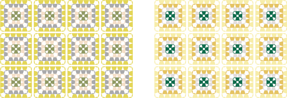
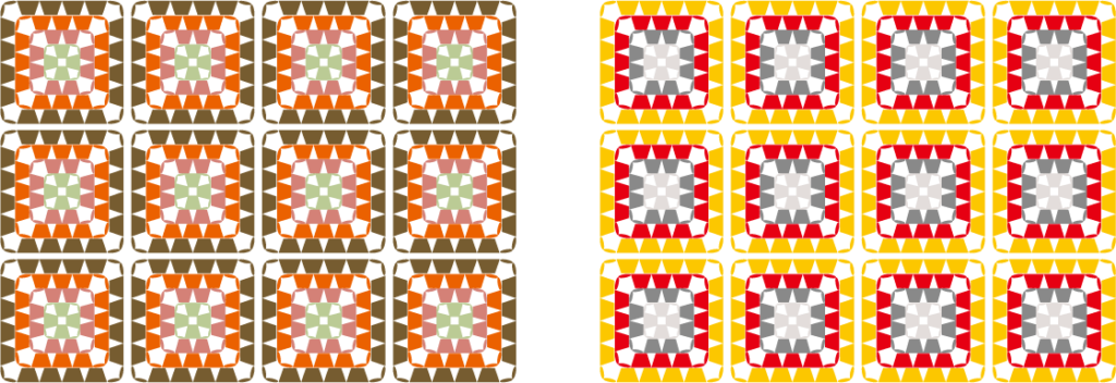
The third is a combination where the shades of light and dark in the center of the motif and the final row are similar.
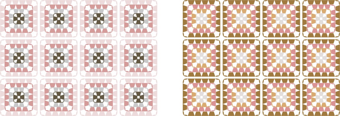
Mustard Yellow x Dusty Blue
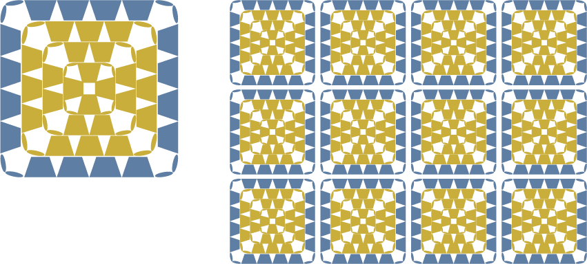
<Color image>
- A slightly retro, playful tone. Nostalgic mustard and urban dusty blue. A color scheme that brings freshness by combining contrasting images.
- By toning down the deep yellow with blue, the color tone is conscious of a sophisticated atmosphere reminiscent of Scandinavian design.
- It's eye-catching but not too flashy, with just the right amount of muted color. It can be used to create cushions that will become the focal point of your interior, or bags that will be the focal point of simple fashion.
- The color scheme caters to the creative curiosity of "I want to knit something a little different from others" and makes the knitting experience more enjoyable.
Terracotta Orange x Navy Blue
<Color image>
- Deep oriental tones. Terracotta like the sky at dusk and navy like the deep night. A mature atmosphere with a touch of exoticism.
- A color scheme that combines warmth and strength. The orange, which evokes the warmth of the earth, is toned down by the navy, creating a balance that exudes a sense of calm yet inner strength.
- The combination of deep colors creates a profound presence. It can be used as a cushion for a calm interior or as a bag to brighten up your autumn/winter outfits.
- We also create carefully crafted pieces with a vintage feel that you will grow to love more and more as time goes by.
If you want to enjoy a sophisticated retro feel, try mustard yellow and dusty blue, or if you want to create a heavy oriental feel, try terracotta orange and navy blue.
Although the impression can be changed by combining different colors, colors with similar shades create a calming atmosphere when viewed together.
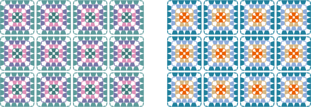
Next, I will post an image of several motifs using two different colors in different color schemes.
Blue-gray
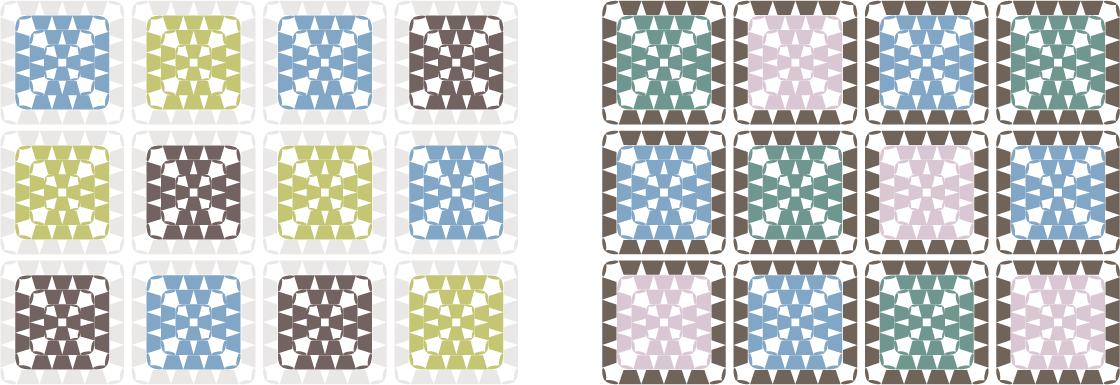
<Color image>
- A clear, cool tone. The color scheme, based on bluish pink, blue, and gray, makes the skin look brighter and creates a clean, dignified atmosphere.
- The clean color tone, which is not too sweet, is suitable for fashion accessories worn by mature women and modern interiors.
Green and beige
<Color image>
- A warm, healthy, and friendly tone. The yellow-orange, green, and brown color scheme gives a warm, bright, and positive impression.
- A natural, soft and comforting feel. Just one piece will instantly brighten up any space, and the gentle color is perfect for family gatherings and relaxing times.
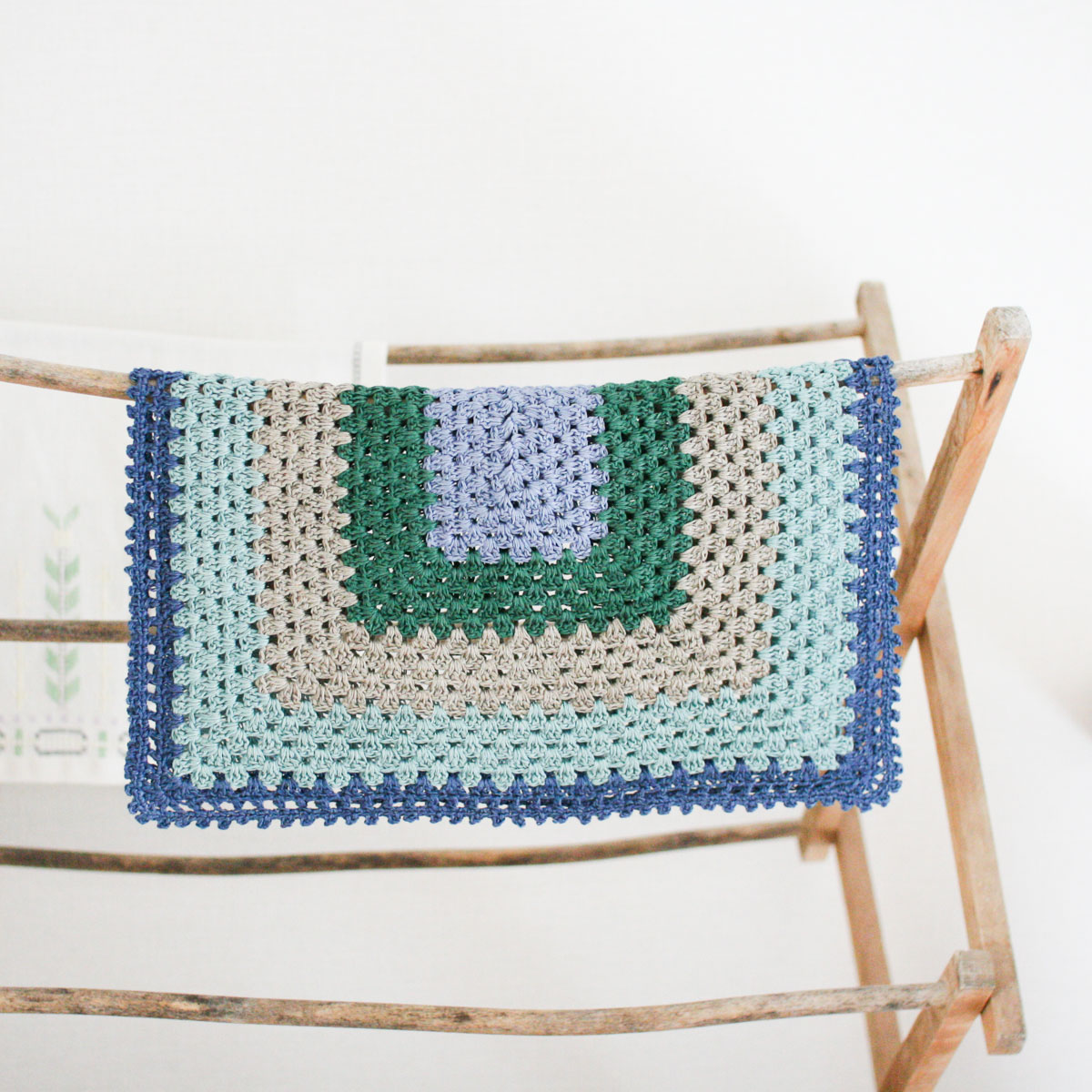
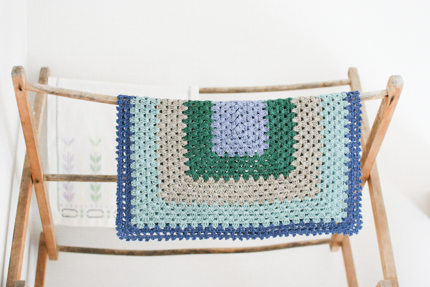
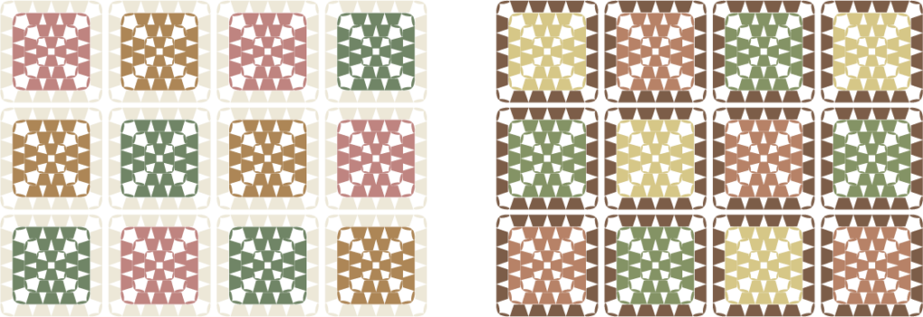
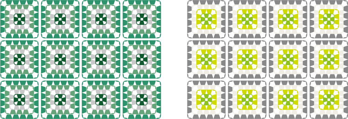
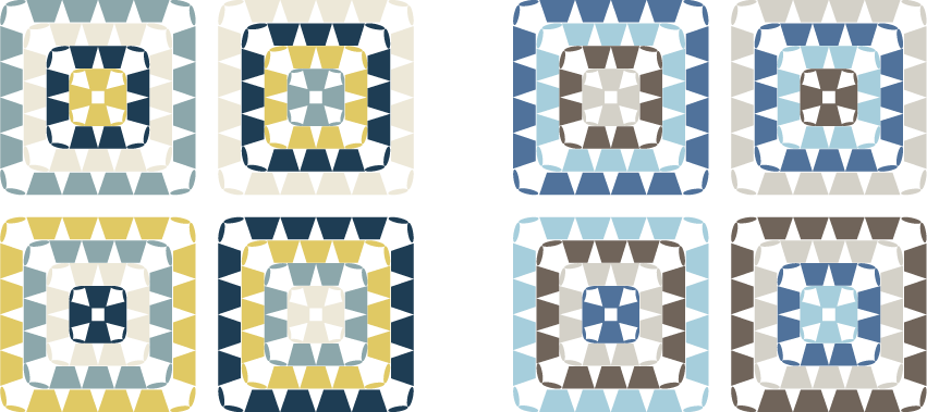
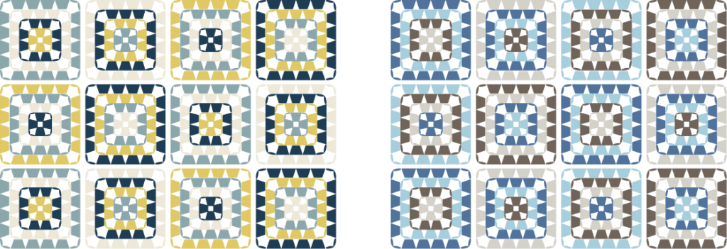
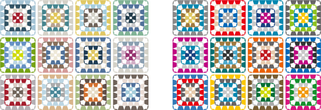
4-color granny square
Here is a color chart that uses a variety of colors, typical of Granny Square.
In addition to the color image, we hope you will also find it useful to see how the shades of color appear when the motifs are lined up together.
The combinations are endless, but here we will introduce five categories: red/pink, blue, green, yellow, and mixed.
Red
- Left: A bluish red and a slightly grayish pink. A bright combination with gray tones.
- Right: A chic and calm combination of brownish red and beige colors.
- Left: A clean color combination of vivid fuchsia pink with cool blue and light gray.
- Right: A striking combination of warm, soft pink and charcoal gray.
- Left: A gentle gradation of pale pink is softly toned down by dark brown, creating a combination that evokes the feeling of spring.
- Right: The combination of orange-brown and salmon pink, a warm, muted color, is lightly lifted by the light gray in the center.
Blue
- Left: The gentle harmony of grayish blue and gray, and the quiet tones with low contrast create a calming atmosphere.
- Right: A refreshing combination of clean, cool blue and light gray with a nice contrast.
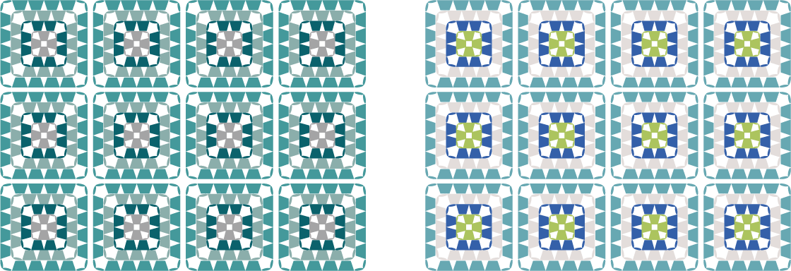
- Left: A subtle blue-green gradation. The contrast between the colors is kept to a minimum, allowing the gaps in the knit to be utilized to create a geometric pattern.
- Right: A coordination that creates a striking contrast between the refreshing light green in the center and the bright blue.
- Left: A chic color scheme of navy blue and dusky yellow. A sharp and mature combination.
- Right: The gray tones are accented with blue, creating an inorganic color scheme that has a somewhat futuristic feel.
Green
- Left: A clean combination of deep forest green, blue-tinged green, and gray.
- Right: A combination of soft, verdant green and gentle blue for a youthful impression.
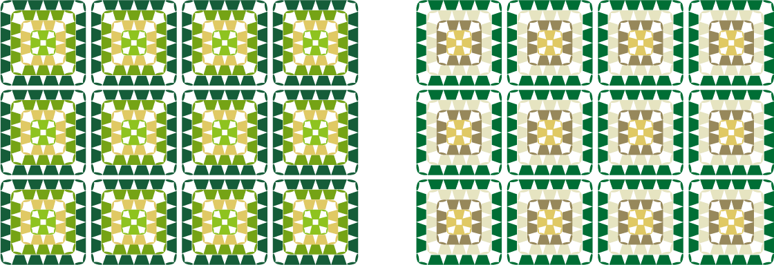
- Left: A bright, summery color scheme that harmonizes warm yellow and green.
- Right: A combination of calming grayish beige and soft green. A color scheme that is both gentle and sharp.
- Left: A subtle gradation of blue-green. A grayish color that is easy to match.
- Right: A unique, bright and refreshing motif that combines gradations of gray and lime green.
Yellow
- Left: Calm tones of gray and dull yellow. A motif with a calm atmosphere and a subtle contrast.
- Right: Bright colors accented with a bold green accent. A combination that is both soft and sharp.
- Left: A combination of muted colors with a chic contrast. It looks like it would be easy to match with both warm and cool skin tones.
- Right: The motif has a calm atmosphere with its grayish muted colors. The color scheme is casually sharp.
- Left: A warm orange motif with a gentle gradation that creates a calm atmosphere.
- Right: A slightly grayish dull orange and sky blue with light gray in between. The color scheme evokes the dry earth and sky.
Mixed
- Left: A French pop combination. Each color is cute and fun.
- Right: A gentle gradation and contrasting colors. A combination that creates an interesting look.
- Left: A combination of cool tones and soft pink that creates harmony.
- Right: A combination of strong colors with few shadings. A motif that will be an eye-catching accent.
- Left: Bright orange and dark brown, a bright and energetic combination.
- Right: Bright yellow and red create a pop of color, while gray creates a harmonious combination.
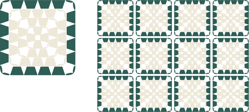
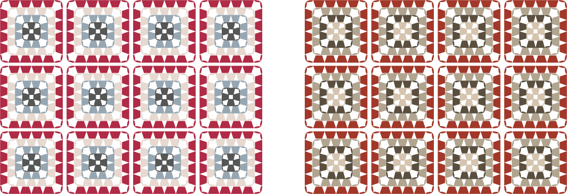
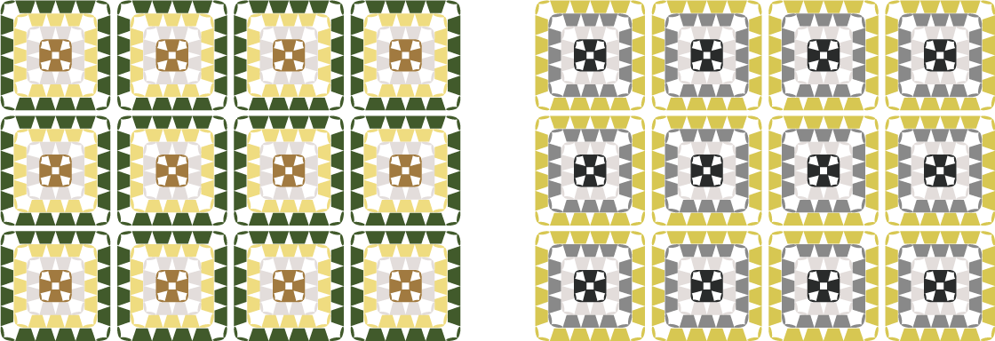
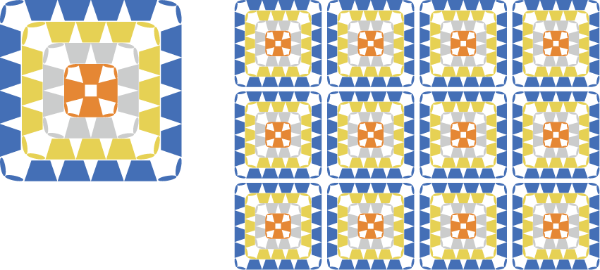
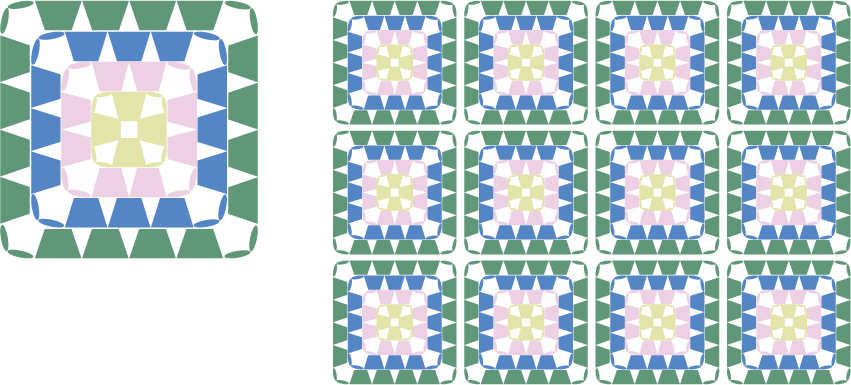
Granny Square knitted with equal amounts of yarn
Granny squares are simple to knit, so sometimes you just want to knit freely without looking at the pattern.
However, you may be concerned about not knowing how much of each yarn to use.
In such cases, it would be convenient if you could finish knitting using the same amount of yarn of each color.
For example, if you use the following color scheme, you can knit four motifs using the same amount of four colors of yarn.
I have also included an image of what this motif would look like when connected together.
Please use this as a reference when you don't want to worry about how much thread to use!
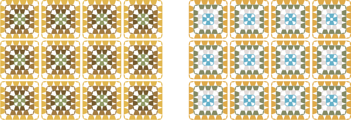
Multicolored Granny Squares
Granny squares are also a great way to use up leftover yarn!
You can use yarn of the same thickness as is, and even if the thickness doesn't match, you can sometimes make it work by double-stranding the yarn or pulling it together.
The leftover yarn comes in a variety of colors, so it looks like it could be used to create some interesting color combinations.
For your reference, I have created an example of a coordination that combines motifs of different colors.
If you unexpectedly come up with a combination that you like, it's likely to become a piece that you will grow to love.
- Left: Soft tones. Using lots of melange yarns and muted colored yarns will create a calm atmosphere.
- Right: A vivid color scheme. Using lots of bright, vivid yarns will create a pop and lively atmosphere.
Granny Square, inspired by famous paintings
So far, we have introduced examples of motif color matching from various angles.
Finally, I tried to match the colors of the granny squares using paintings by world masters as a reference.
Can you tell which of the following three color charts are based on which pictures?
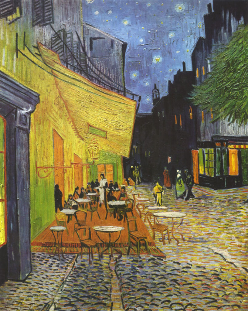
Van Gogh Cafe Terrace at Night
The blue of the night sky, the yellow and orange of the cafe lights, and the gray of the cobblestones.
There are still colors to add, but I have used these four colors as the motif color scheme.
Image: Source Wikimedia Commons(Public Domain)
.jpg)
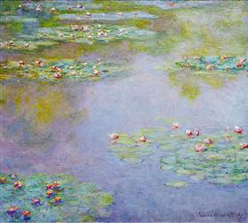
Monet Water Lilies
Bluish green, blue, purplish pink, and a small hint of yellow.
I used four colors as a motif to convey the atmosphere.
Image: Source Wikimedia Commons(Public Domain)
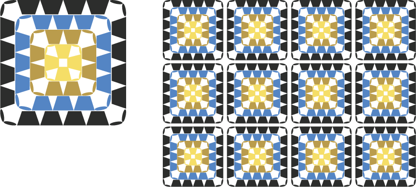
Vermeer Girl with a Pearl Earring
The jet black background, the vivid blue of the turban, the light yellow behind it, and the mustard gold of the body.
I used these four striking colors as the motif for the color scheme.
Image: Source Wikimedia Commons(Public Domain)
This motif is fun for beginners to crochet.
So far, we have shown you some examples of color schemes for crocheted granny squares.
Were there any color images that caught your interest?
Choosing yarn is one of the fun parts of creating a piece of art.
Especially when knitting pieces using multiple colors of yarn, taking the time to think about color matching is an important process.
At first, it may be difficult to imagine the color of the finished work, but in a good way, you may end up with a work that is unexpected.
Even now, I still crochet with excitement, precisely because I don't understand it.
Granny squares are a wonderful motif that brings a little world of fun to your home.
Thinking about color matching has made me want to knit a granny square too.
If you have the opportunity, please try knitting it!