Index
[June 19] We will start selling the kits from today.
The release date for this kit has finally arrived.
As this is a new product, we are releasing the product page ahead of the official sales launch.
Please check the product page for details.
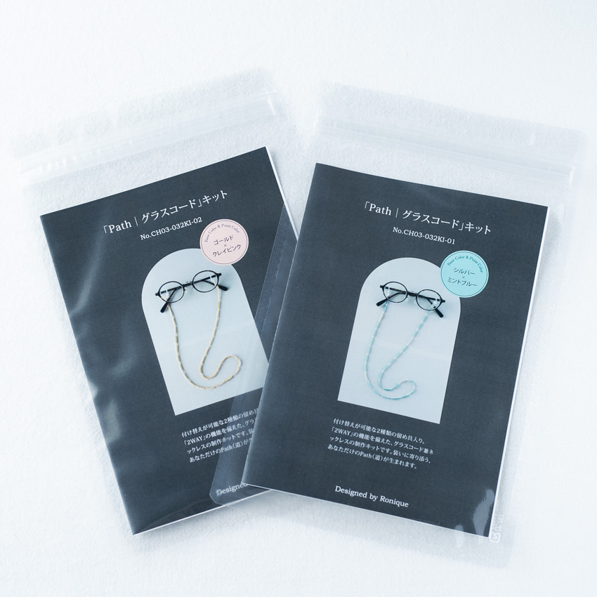
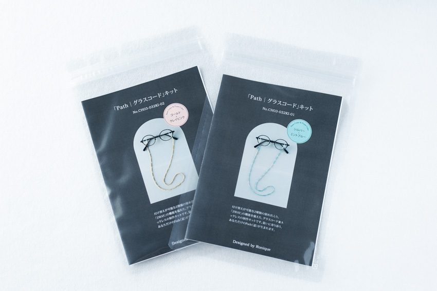
Beaded crochet "Path | Glasses Cord" kit (crochet pattern: printed) with instructional video!
The kit will be available for purchase at Ronique Store during the following period.
[Sales period]
June 19, 2026 (Friday) 21:00 - June 26, 2026 (Friday)
The product page is also available for pre-order, so you can check the details of the kit contents and any additional items you will need to prepare.
[6/12] Kit sales are just around the corner.
Preparations for the kit sale are now in their final stages.
Making the kit takes more time than you might imagine, but psychologically, ordering the printed materials feels like the biggest hurdle.
The printed materials are the cover of the kit and the knitting pattern, but even after making several versions, I still don't know how to proceed.
The biggest hurdle is photography; it's my poor planning that makes me realize, "Oh, I haven't taken this picture yet...!"
There have also been times when I tried cropping an image, only to find it didn't fit within the frame, requiring me to retake the photo. It really makes me realize that I'm still not very good at this.
As I write this, I realize just how incredibly creative the process of selling knitting kits is, and it's quite daunting.
Even with something as simple as gardening, I feel like there are very few, if any, things that can be done haphazardly and somehow manage to get done.
Perhaps I was underestimating them.
I had mistakenly assumed that since weeds are so resilient, the plants I bought would grow even if I left them alone.
The more I nurtured them, the more I learned about the nuances of the necessary care and the reasoning behind everything.
I've tried following books to get my cherry tomatoes to grow in clusters, but I've never succeeded even once.
I've come to realize that being haphazard is simply not going to cut it.
The same applies to photography.
When you realize that relying solely on intuition isn't working, the more you research, the more detailed and precise the how-to guides become.
Behind things that seem to work out by chance, there are often well-thought-out methods and meticulous procedures.
This idea is very encouraging.
If it was just a coincidence, then it would be impossible to catch up or learn from it through effort.
The steps involved in bringing this kit to market could, depending on how you tell the story, become a fascinating narrative in itself.
Even after completing a knitted project, a vast amount of creative work awaits.
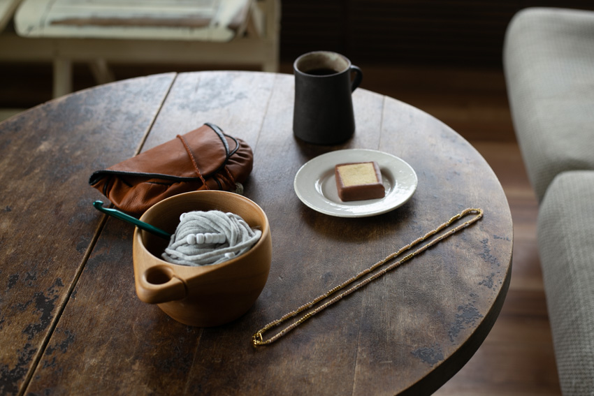
Yesterday, I finally finished writing the text for the product page.
When I'm writing, I really find myself thinking about the person who will be knitting for me, someone I don't even know yet.
I think I was able to write it honestly.
Now, let's move on to the next step today.
I'm really dreading translating this into English!
[6/1] Working steadily towards kit sales
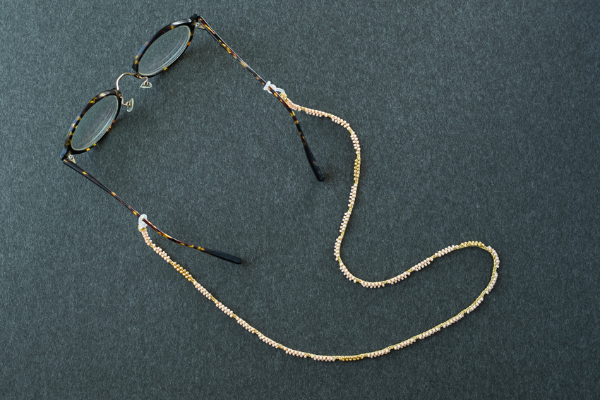
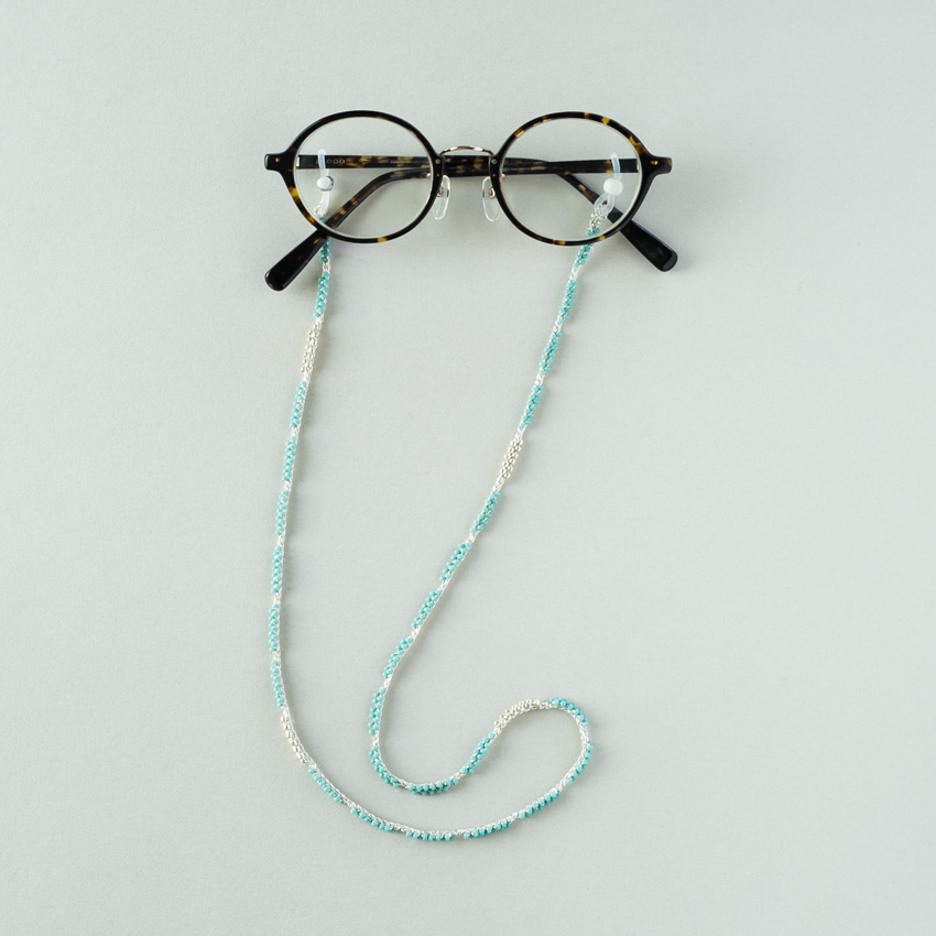
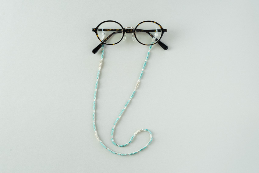
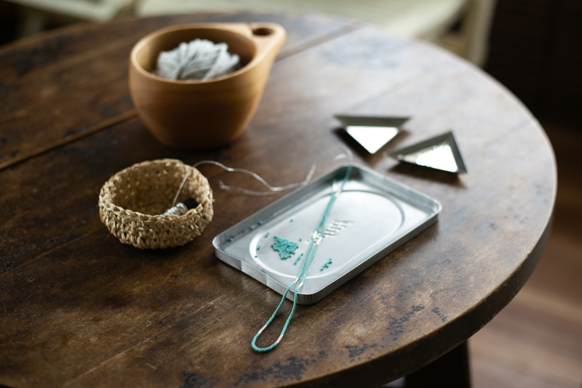
Beaded crochet eyeglass cord.
I was taking photos of the finished product for the kit's brochure.
When I used my favorite glasses as the subject, I couldn't see myself at all, so the shooting process was very much a trial-and-error process.
In addition to my pre-existing nearsightedness, in recent years, it has become commonplace for me to take off my glasses when looking at things up close.
When I was younger, I didn't really understand the need for eyeglass cords, but now I think, "Ah, I see!"
However, like myself, there may be many people who have never actually used a glasses cord.
This time, I decided to choose a color that wouldn't be too flashy, making it easy to use even as a first eyeglass cord.
Since it's the summer season, brighter colors feel refreshing.
Furthermore, I think a lighter color combination is easier on the eyes and more suitable for the first release.
I'm already imagining how nice a range of chic colors would be for the winter season—I'm really in the mood to try out other color variations.
With simple steps and a reasonable timeframe to complete, this is a project you'll want to knit again and again.
I feel like we're about halfway there in preparing the kit.
The product name is "Path" - Glasses Cord.
It means a path or trail.
This piece involves weaving beads in two steps, much like following a single path.
I look forward to the day you can knit it, and I will continue to work hard on the preparations.
[5/25] Process photography again
I recently started making a knitting tutorial video, but I wanted to revise it, so I decided to reshoot it.
I had to give up yesterday because of bad weather, so I'm really happy about today's sunny weather.
Natural light is best, but unlike professional photography, it takes time to finish the shoot.
This might be one of the reasons why people are hesitant to start shooting videos.
I have to choose the time of day carefully, and I'm in a hurry.
Furthermore, when you get tired, you might make some shocking mistakes.
After several failed attempts, I finally thought I had finished taking the perfect shot! But then...
It wasn't set to "record"...
The battery ran out halfway through...
My memory was full, so I couldn't take any pictures...
I've experienced situations like this, which I find hard to believe, many times before.
Even though I was sleepy, I tried my best to knit one more row, but I made a mistake somewhere and ended up having to unravel it.
If you've ever knitted, have you ever had this experience?
It's exactly like that.
Whether you're knitting or filming a video, stop when you're tired.
I understand that, but...
I was relieved that I was able to finish today while I was still sharp.
Having gotten through the video shoot, I feel like the preparations have progressed rapidly.
Since this project involves beadwork, I planned to film a video from the beginning.
Knowing that this video might help you knit without hesitation is the greatest encouragement for me.
Furthermore, the sense of reassurance that the person explaining has "fully conveyed" their message is another major appeal of videos.
[5/22] Works that can be enjoyed because of poor eyesight
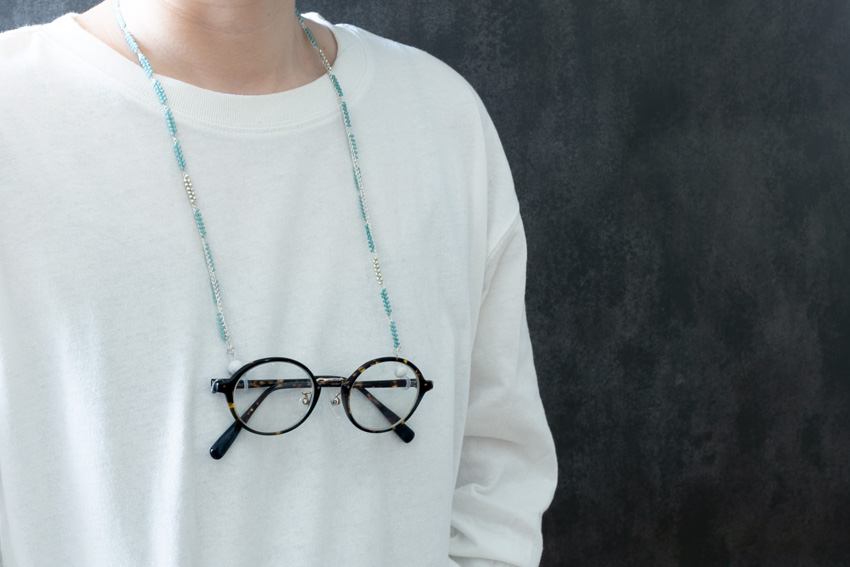
This is what I was crocheting with beads: a glasses cord.
Having poor eyesight can be inconvenient in many ways, but I think it's also fun to discover items that are useful precisely because of that.
I tried knitting both silver and gold versions, and decided on blue for the silver one.
I chose the colors while imagining a combination like turquoise and sterling silver (925).
When you thread the blue beads onto the string, it creates an elegant look reminiscent of Tiffany Blue.
The colors were so lovely that deciding on this combination was easy.
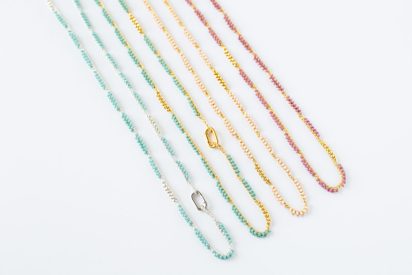
I'm undecided about which one to go with: gold.
All of the candidate colors look lovely and give off a jewelry-like feel when threaded onto gold thread.
I couldn't decide which color to choose.
So, I wanted to hear your opinions, and decided to conduct a survey on Instagram!
The available silver and gold color options are as follows:
If there's a color you really like, please cast your vote on Instagram!
[5/19] Prototype for color selection
I'm steadily working on preparing a new beadwork project.
When I arranged the beads I bought in abundance in Tokyo, it created a miniature world that resembled a shop.
I spent a lot of time choosing them, so they're all my favorite colors.
It's a familiar sight to find some colors mixed in that I tend to just stock up on and be satisfied with.
The colors I buy and use, and the colors I buy but never use, are usually in the same pattern.
Even if you vaguely understand why, there are certain color palettes that you just can't help but want.
Conversely, when it comes to colors I actually use frequently, I think I buy them with a bit of a "should" mentality mixed in, because I'm sure I'll need them later.
Colors that are pleasing to the eye but difficult to use, and colors that aren't so pleasing but that you want to use.
The former, which immediately sparks an impulse at first sight, is added to the cart without hesitation. Once the impulse subsides, you remember and add the latter to the basket.
If someone asked me what my favorite color is, I'd answer the latter. But I like the former too.
It's strange how it can be reversed.
It might be like the relationship between ice cream and coffee.
For this color selection, I had a personal theme in mind: colors that blend well with my skin tone. This made it easier to narrow down the choices.
And as I looked at the several prototypes that had been made, I realized that the visually pleasing colors weren't so bad after all.
Beadwork might be a type of knitting that's easy to enjoy with both ice cream and coffee.